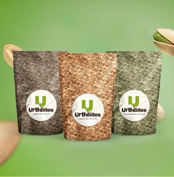
Urth bites
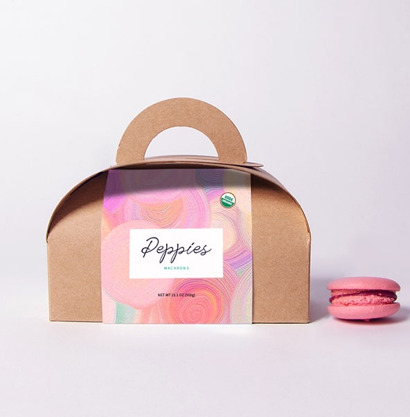
For our client Urth Bites, our goal was to introduce their product branding,
specifically their brand identity, naming, and package design.
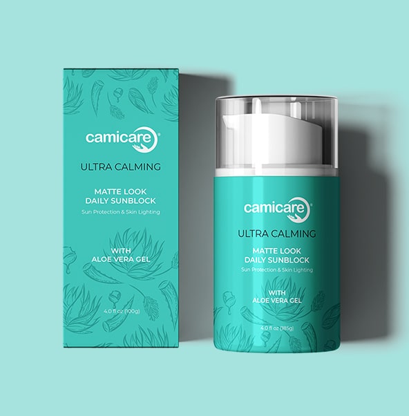
Camicare
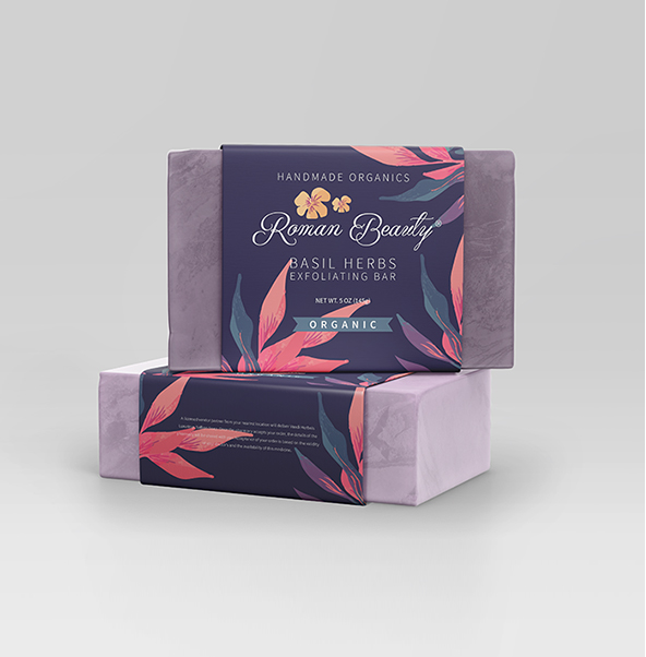
Classy and extraordinary design is what was in the brains while designing the cover of Roman Soap. The design portrayed the quality of the product as well as the identity of the brand.
Know More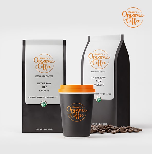
Maggy's Organic Coffee
Maggy's Organic Coffee was the best with a minimalistic design. The design has to be sync with the different flavors brought by the brand each time.
Know More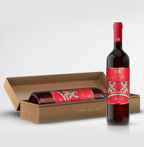
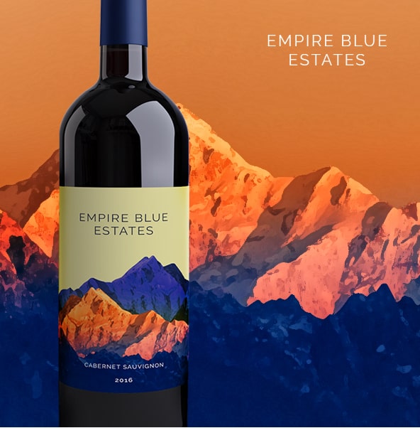
Crown View Estate
The taste and feel of Crown View Estate were made possible through a classical theme with gold foil and a logo that was royal to show the legacy of the brand.
Know More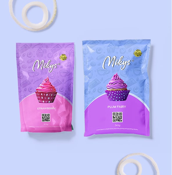
Mikys
Mikys wanted the taste of their cupcakes to be felt in the design itself. The new innovative and colorful design of Mikys could bring water in the viewer’s mouth.
Know More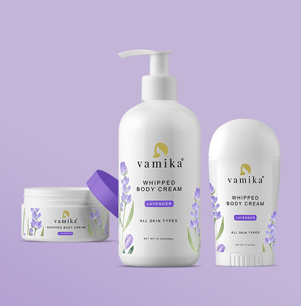
Vamika
Classy and extraordinary design is what was in the brains while designing the cover of Roman Soap. The design portrayed the quality of the product as well as the identity of the brand.
Know More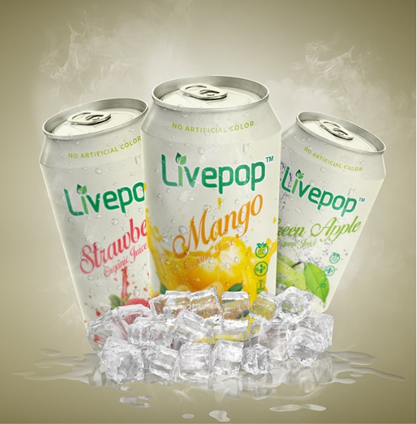
Livepop
Livepop wished if they could highlight their benefits for which they opted for a brand refreshment. The decision did bring an overall change in their appearance and feel.
Know More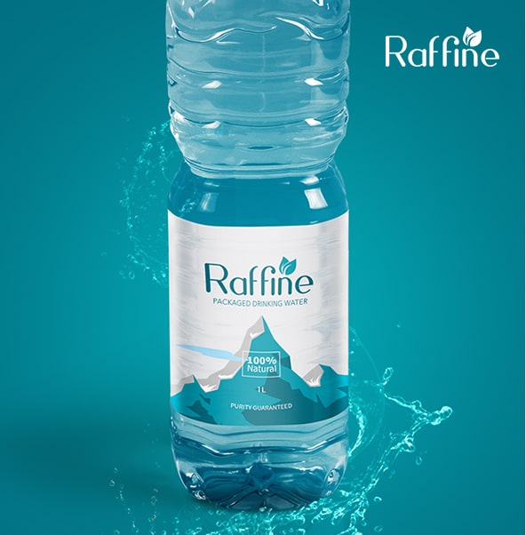
Raffine
To taste the uniqueness and a strong shelf presence, Raffine decided to go for a revamped look that is inimitable.
Know More